Setting the Image Dimension
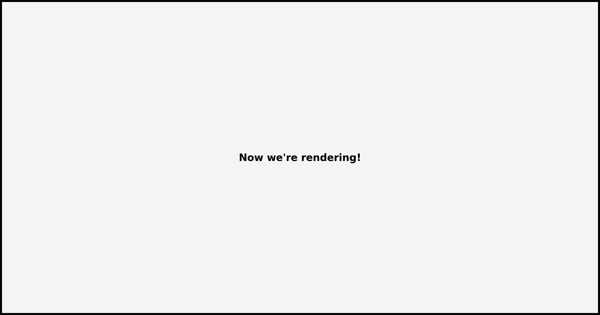
When you send an HTML snippet to the API, it automatically crops your image to match the height and width of the outermost HTML element. For instance, the example below generates a screenshot with a height of 630 pixels and a width of 1200 pixels.
<div class="p-8 space-y-6 bg-gray-100 border-4 border-black flex justify-center items-center" style="height: 630px; width: 1200px">
  <h1 class="text-xl font-bold">Now we're rendering!</h1>
</div>

<script src="https://cdn.tailwindcss.com"></script>
Would generate an example like:
Please note: This method applies solely to HTML snippets. It does not
automatically crop full HTML pages that contain <html> and <body> tags.
High Resolution Images
Modern devices come with varied DPR (device pixel ratio). High-quality
screens typically have a 2x or higher DPR, which means they need twice or
thrice the number of pixels than traditional, lower resolution screens for
crystal clear images. Our image rendering service considers this by generating
template images at twice the size and setting the default device_scale
parameter to 2.
Therefore, if you specify 1200px in your HTML, it will result in an image that's 2400px, to cater to high-resolution screens.
Setting the Viewport
Our image rendering service uses Google Chrome to generate images. Like any web browser, the viewport setting determines the total area that the browser can render.
The default viewport setting is
1366x768. Therefore, when you use theurlparameter to generate a screenshot of a web page (or when sending a full HTML page with a<html>and<body>tag), the resulting image will have these dimensions. It's important to note that the defaultdevice_scalesetting is 1 when using theurlparameter, specifically for this reason.You can modify the viewport settings using the
viewport_heightandviewport_widthparameters. Both parameters are necessary for the changes to apply.This feature is optimal for full pages and screenshots. When rendering HTML templates, we recommend keeping the viewport settings as they are and using auto-cropping instead.
Resizing on-the-fly
All the images rendered and hosted on our CDN can be adjusted on the fly by
adding a height or width query parameter to image URL.
If only one parameter is used, the image's aspect ratio will be preserved. If both parameters are used, the image will be cropped and resized as necessary.
We're here to help!
Have questions about how to best use our image rendering service? Please reach
out to hello@ervsoftware.co and we'll usually respond within 12-24 hours.